Earlier this week, a tweet by R. Andrew Lee (a wonderful New Music pianist that you should really discover) caught my attention:
Were I a composer, I would definitely use computers, but as a performer, I am starting to prefer handwritten scores.
— Andy Lee (@andyleedma) February 27, 2012
A fascinating conversation ensued and I asked Andrew if he wanted to share his thoughts in an opinion post. Here it is:
As a pianist that almost exclusively performs new music, I have often encountered handwritten scores, and for a long time I dreaded seeing them. New music can be difficult enough to decipher at times and having to also deal with the peculiarities of a composer’s handwriting doesn’t help. Still, some of my favorite composers wrote many of their pieces by hand, and if I was to learn their music, I had to push through and deal with it. Eventually, of course, I would become comfortable with each composer’s handwriting and the reading difficulty would diminish, but I still didn’t appreciate the initial learning curve.
Then, by happy accident, I was given the opportunity to change my mind.
I had been an admirer of Ann Southam‘s music since Alex Ross made Simple Lines of Enquiry, recorded by the remarkable Eve Egoyan, one of his CD picks in 2009; the way she combined 12-tone writing with minimalist processes was stunning. Sadly, Ann Southam passed away about a year after I first encountered her music, and I knew immediately that I had missed an opportunity to get to know a wonderful composer. Her death was a long-overdue impetus for me to really start digging into her piano music.
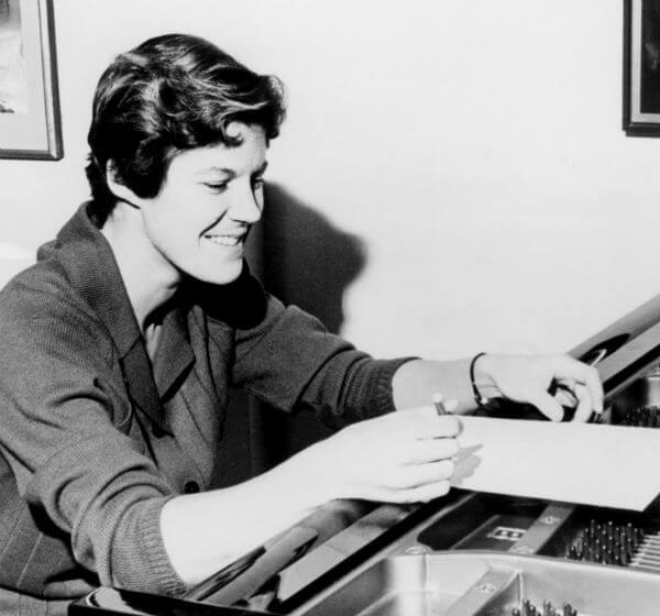
One piece that caught quickly caught my eye was Qualities of Consonance (1998). As I learned the piece from a handwritten score, I found some inconsistencies and notational oddities that weren’t entirely clear. Even after living with the score for a while I still had a couple of questions, and not being able to contact Ann, I went to Eve Egoyan, for whom the piece was written. During a delightful phone conversation, it quickly became clear that we had different versions of the score. For whatever reason, I had been given a facsimile of the manuscript instead of the printed version that no doubt appeared a while later. The Canadian Music Centre (a fantastic organization) sent me the typeset version at no cost, and suddenly I had the opportunity to compare these scores side-by-side.
As it turns out, I hated the printed version.
I was completely unprepared for this. Had I been given these two scores at the same time, I’ve no doubt that I would have grabbed the printed copy and rarely given the handwritten score a second look. But having already familiarized myself with her handwriting, making both scores equally readable, the printed score seemed sterile and cold. It was as though I had been receiving these beautiful handwritten letters from a friend who then suddenly started communicating exclusively through email. It was a letdown, a disappointment, and I’ve rarely even looked at the printed copy on my shelf.
Here are the first two lines of Qualities of Consonance, which hopefully demonstrate the stark difference between these two editions. (You can click on each image to bring up a larger version.)
I don’t want to give the impression that I think the engraver did a bad job, quite the contrary. I just think that no computer-engraved version could ever quite give the same impression as the handwritten score. There are many differences that can be seen at a single glance. Southam draws the solid note heads noticeably smaller than those that are open, her slurs tend to have very little curve, and tied notes are often very close to each other. None of these qualities are present in the computer-generated score.
Having made this comparison, I now find that I really enjoy receiving handwritten scores. True, the initial reading hurdle still exists, but I find that I no longer care. (Unless the penmanship is completely unreadable, of course.) There is information to be gleaned from a composer’s idiosyncratic handwriting, and from my perspective, that makes the relationship between composer and performer feels more intimate and personal.
A corollary to this change of opinion is my growing realization about how subtle differences between even computer-generated scores can affect a performer’s interpretation. Font choices, font size, spacing, line breaks, page breaks, note size, slur curvature, and many other factors become subconscious signals to a performer. The visual impression a score provides says something about a piece that the notes and performance directions cannot.
I know that there are many composers who consider this visual dynamic of composing, but I also think that few take it seriously enough. A score is, after all, nothing but a visual guide to a performer. There is a decent amount of specific information, but at the end of the day so much of it is frighteningly arbitrary. Given that, I don’t think font choice or even size can be considered insignificant in a score, and now that composers have much greater control of what their music looks like, these are decisions that must be considered carefully.
Allow me to illustrate this sort of subtle difference with the Waldstein sonata. The first image you’ll see is from the rather common Dover edition from 1970, and the second is the Henle Urtext edition from 1980.
What is perhaps first striking is that while these scores are the same size and I’ve given you the first three lines of each, the Henle edition has already managed to squeeze in two more measures. And yet, the Henle seems much less cluttered than the Dover. The Dover edition uses larger fonts, crams the systems a little closer together, includes more fingerings, and has gigantic measure numbers. The notes themselves are roughly equivalent in size, but the extra white space and thinner staff lines of the Henle provide a much cleaner layout. Notice also the difference in the staff breaks. Obviously, this is not something that can (or even necessarily should) be considered at all times when engraving, but consider how these breaks might alter the perception of the piece and its performance.
At this point I must say that I do not think all performers will be affected the same way by such decisions, anymore than they might interpret Allegro con brio the same way, but it is information that is worth considering. As a performer, I have to be aware of how the visual impression of the score might be affecting my performance, either positively or negatively. (That clean Henle look is great for reading, but does it convey this music best?) For composers, I’d recommend really taking a step back from the details of the piece and consider what it looks like. Does it give an impression visually that is in line with your intentions or does it contradict them?
This is then where handwritten scores can have a bit of an advantage; the style is inherently your own. Granted, handwriting a score must be a laborious process, but as a performer I’d say it’s something worth exploring (as others have notably discovered). Even if you find the process too tedious or don’t necessarily like the final product, you can still incorporate a bit more of that handwritten style in your computerized scores.
Don’t let a computer dictate what your scores look like. Compose by hand, develop a visual style, and realize how much information is between the lines.
