
In “Sheet Music in Colour”, you explore the relationship between music and art/design. What motivated you to start this work?
Really it was a combination of two passions, music and design. Both play a large role in my life. It was while I was at college around the age of 16 when I first started to look into the idea of combining the two disciplines. I think the first thing I ever did was a storyboard illustration which took lyrics and transformed them into a story which was loosely based on the words.

When I was at university I moved into the idea of typography and music, looking into things such as concrete poetry and the work of the futurists. They took everyday sounds such as slamming doors, shuffling crowds, printing works and power stations, and made typographic compositions, breaking down the sounds into simple phonetics. These pieces were incredibly dynamic for their time and still are today. I think I was fascinated by this idea that words are just visual symbols which we decode through language.
Everything got interesting when I started to introduce colour, and in particular analogies between musical notes and colour, this led me to devise colour systems. I then moved onto the idea of recording sound in particular places, and using a chromatic tuner, transcribing the sounds that had been recorded, these could be sounds such as birds signing, a train passing, people walking etc. I was then able to take the colours associated with these notes and create designs from them. Kind of like a colour record of a particular moment in time, a modern landscape using sound visually. The whole aim of all of my work on visual music is purely experimental, some pieces have a method and some are purely visual and abstract, I’ve found this abstract approach by no means makes them less important if anything the abstract pieces are the most interesting, they chart raw creativity something that can’t be explained.

Synesthesia has been a recurring idea in classical music, whether the composer was/is actually suffering from it (Leonard Bernstein, Michael Torke, etc.)—or just pretended (Skriabin, Messiaen). Where you thinking about synesthesia when you worked on this piece?
I first read into Synesthesia when I was studying, I was fascinated by the idea that people actually hear colours or taste sounds. When I was putting together my ideas on which colours should match up with which sound I was basing my ideas purely on what I felt. There have been ideas put forward by scientists such as Newton which link colours and octaves using vibrations of light etc, but this wasn’t something that I wanted to dwell on, my aim was purely creative. If Synesthesia showed me anything it’s that everyone wether they have the condition or not, has a different idea of what a particular sound looks like through colour. There is no wrong or right way there is just how you feel about it. If someone were to ask you ‘what’s your favourite song?’ or ‘which is your favourite colour?’ our responses are emotional, there tends to be an underlying personal reason as to why we choose the answers we do, sometimes we can’t explain the reasons, they have developed in our subconscious since we were young.
Where did your reflexions about music and color eventually lead you?
I see the whole idea as an ongoing study, there isn’t an answer or really an end, there is just the chance to make observations, to be creative, to make people think. That is the real meaning behind the work. I’ve created some pieces which people might like to hang on their wall, or talk about with friends, and that is great! Maybe someone else will take on the idea of visual music and take it in a totally different direction which would be fantastic.

Does your Yellow Study 01 have musical implications too?
Yellow Study 01, was created around the same time as I was making the sheet music pieces, when i’m working on things in tandem one piece of work can tend to lend from the other and visa-versa. The piece was part of a study into relative space and colour, the idea was to look at how objects interact when they are near each other, and the negative space they create, the unknown which is as integral as what actually exists, kind of like matter and anti matter, it is all about balance.

Do you have other music-inpired pieces in the works?
I have ideas that i’m currently working on, I wanted to introduce actual instruments and create music, I don’t want the pieces to become overly serious however, I’d like to try to keep things creative! I’m also hoping to create some new visual pieces for a small monograph which is being produced next year.
—
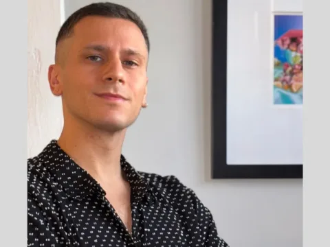
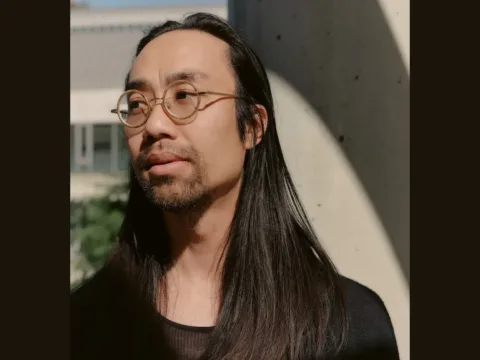
 Mike Lemanski is a freelance illustrator/designer from the UK. Visit http://www.mikelemanski.co.uk, or follow Mike on Twitter: @MikeLemanski Buy Mike’s print at New Leaves Studio.